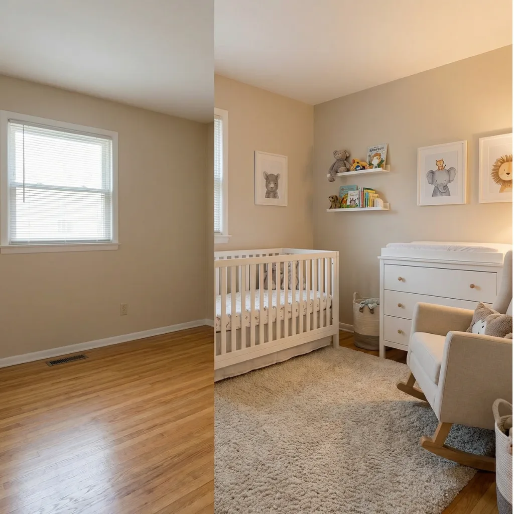
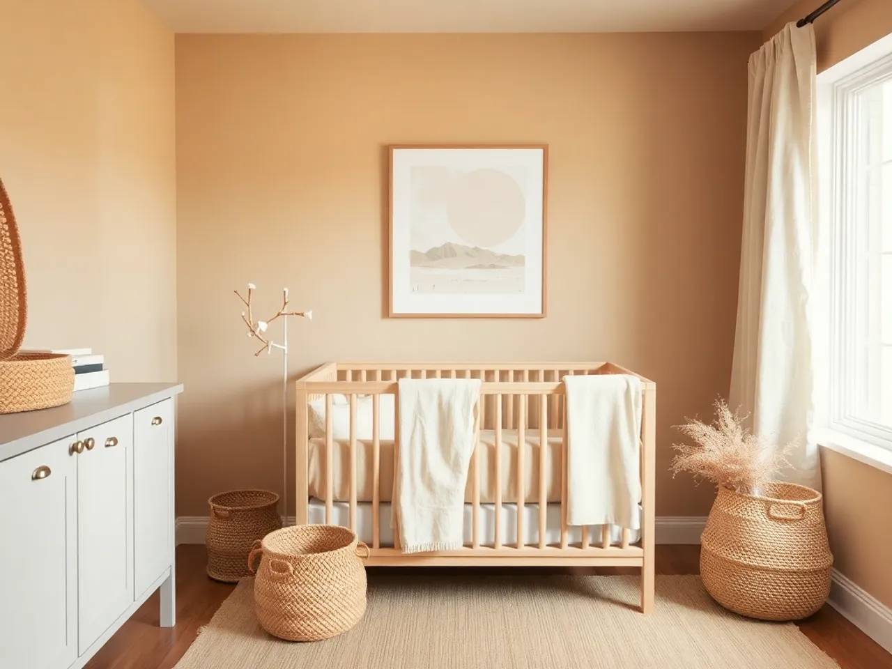
Beige, greige and taupe are three different decisions
They get used interchangeably and they behave nothing alike in a room with one window.
Beige
Yellow underneath
The warmest of the three. Excellent in a north-facing room where everything else goes cold. Goes sallow in strong afternoon west light.
- Wall #F3EBDD
- Beige #E2D5BE
- Deeper #C9B99C
- Trim #FAF7F0
- Contrast #3B362D
Greige
Grey underneath, and the most predictable
Sherwin-Williams Agreeable Gray and Accessible Beige, Benjamin Moore Edgecomb Gray and Pale Oak. If you want one safe answer for a nursery, this is it.
- Wall #EAE3D7
- Greige #DBD1C1
- Deeper #C7BBA8
- Trim #F7F4EE
- Contrast #38352F
Taupe
Brown underneath, and the riskiest
Darker and more sophisticated on a chip. In a small room with one window it very easily goes muddy. Use it on the lower half of a panelled wall rather than on all four.
- Trim #E4DACC
- Taupe #B9A991
- Deep taupe #8E7E68
- Light #D6C9B4
- Contrast #33302A
The texture rule, which is the whole thing
In a colored room, color separates the layers. In a beige room nothing does, so the layers have to separate themselves by surface. Count these in your room and aim for at least four:
- Woven natural fiber. Jute rug, rattan basket, cane cabinet front, seagrass pendant.
- Soft and irregular. Boucle glider, sheepskin, a chunky knit blanket.
- Smooth and hard. Painted wood, ceramic lamp base, a glass or metal frame.
- Real wood grain. Visible grain, not a wood-look laminate. This is the one that fails most often.
- Matte and dark. Black curtain rod, charcoal frame, bronze drawer pull.
Three or fewer and the room reads as unfinished. Five and it reads as designed with no further effort and no additional color.
The pink problem
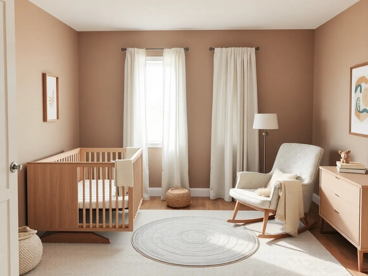
Every beige has a red undertone sitting under the yellow. Most of the time you never see it. You see it when the room contains something else carrying red, and in a nursery that is almost always the floor.
| Your floor | What happens | Pick |
|---|---|---|
| Red or orange oak | Beige reads distinctly pink | A greige with a green base, which cancels the red |
| Mid or white oak | Behaves normally | Anything in the three families above |
| Grey-washed or LVP | Warm beige looks yellow against it | Greige, and warm the room with textiles instead of paint |
| Carpet in a cool grey | Beige and the carpet visibly disagree | Match the carpet's temperature, or replace the carpet, or use a large rug over it |
Which is the practical rule from the paint guide restated: hold the sample against the floor and the trim, never against a white sheet of paper.
Add the darkest thing in the room
The single most reliable fix for a beige nursery that looks unfinished is not more beige and not an accent color. It is one genuinely dark object. Value range is what tells the eye a room was composed.
- A matte black curtain rod, which costs about $25 and changes the whole room.
- Black or charcoal picture frames rather than natural wood ones.
- Bronze or black drawer pulls on a light dresser.
- One dark ceramic or a black-shaded lamp on the dresser.
One of those is usually enough. Two is better. Skipping it entirely is why so many neutral nurseries look like they are waiting for something to arrive.
Questions people actually ask
Is a beige nursery boring? +
What is the difference between beige, greige and taupe? +
Why does my beige look pink? +
Does beige work with white trim? +
Keep going
Gender neutral nursery
Six neutral palettes that are not beige on beige.
All nursery paint colors
The other families and the undertone traps.
Boho nursery
The same neutrals, with texture pushed further.
Grey nursery
What to do if your neutral has gone cold.
Sage green nursery
The smallest step from neutral into color.
Nursery organization
In this palette the baskets are also the decoration.