Four blues, and they are not interchangeable
1. Dusty blue
The safe one
Greyed down, low saturation, reads as a soft neutral rather than as a color. This is the blue that does not date.
- Wall #EEF2F3
- Dusty blue #8CA3AD
- Sand #DDCFB8
- Warm white #FAF8F4
- Contrast #3A484D
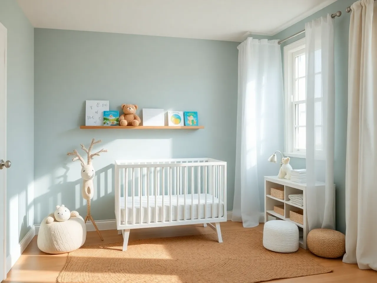
2. Green-based blue
The forgiving one
Sits between blue and green and refuses to go cold. Best choice in a room where you are not sure what the light does. Benjamin Moore Palladian Blue and Sherwin-Williams Rainwashed live here.
- Wall #E7EEEA
- Sea blue #A8C0BA
- Linen #D9CDB8
- Trim #F8F6F0
- Contrast #3C4C48
3. Navy
The one people remember
Not a pale color used darker. A different decision entirely: navy is a neutral in this context, closer in behaviour to charcoal than to blue.
- Trim #F5F1E8
- Navy #27384F
- Oak #B0895E
- Cream #E4DACB
- Brass #C9A227
4. Clear sky blue
The one to think twice about
Bright, saturated, cheerful, and the single fastest way to make a nursery look like a nursery from a specific decade. Fine as a cushion. Difficult as a wall.
- Wall #DCEAF5
- Sky #8FBEDD
- Trim #FFFFFF
- Cream #E8DFD0
- Contrast #33465A
The light problem, which is the whole article
Blue has no warmth of its own to fall back on. Every other family has something underneath it: greens have yellow, beiges have red, greys have whatever base the manufacturer put in. Blue in cool light is just less blue.
| Window faces | What happens | What to do |
|---|---|---|
| North | Goes grey and flat. The most common complaint about blue nurseries. | Use the green-based blue, or drop blue to an accent and let a warm neutral carry the walls. |
| South | Washes out. A pale blue reads near-white by midday. | Go one or two steps deeper than the chip suggests. |
| East | Good in the morning, dull after 2pm. | Works well. Plan a warm lamp for the afternoon rather than a different paint. |
| West | Turns green-gold in the evening light. | Pick a blue with a grey base, not a green one, or it will read distinctly green at bathtime. |
Test it properly before you buy a gallon. The method is in the nursery paint guide: two coats on card, both walls, three times of day.
What goes with blue
| Element | Best | Avoid |
|---|---|---|
| Trim | Warm white or cream | Cool bright white, which makes the blue look cold and the trim look blue |
| Wood | White oak, birch, natural rattan | Orange pine and red-toned oak, which fight blue directly |
| Metal | Unlacquered brass, matte black | Chrome and brushed nickel, which double down on the cold |
| Accent color | Sand, camel, clay, blush, mustard | Grey. Blue plus grey is the flattest pairing available. |
| Textiles | Linen, wool, jute, anything with visible weave | Flat synthetics, which make a pale blue room look like a waiting room |
The one rule worth memorising: blue needs something warm in the room or it goes institutional. A tan leather pouf, an oak stool or a camel throw does the whole job.
When navy is the right call
Navy is not a stronger version of pale blue, it is a different plan. Reach for it when at least two of these are true:
- The room is already dark and you are tired of fighting it.
- Daytime naps matter and you want the room to help.
- The walls are in decent condition. Dark paint shows every patch and roller mark.
- You can add a second light source. A navy room with one ceiling bulb is a cave, and not in the good way.
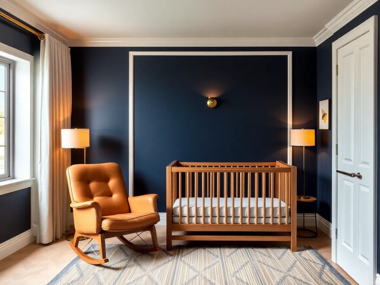
Half-height board and batten in navy is the version that gets the look and hedges the risk: about $150 in MDF, it takes the toddler-height damage, and the top half of the room stays light. More on that trade in the boy nursery guide, where panelling comes up most.
When it goes wrong
- It reads grey. North light. Move to a green-based blue or change the bulbs to 2700K first.
- It reads like a hospital. Nothing warm in the room. Add wood or leather, not more blue.
- It reads babyish. The blue is too clean. Every blue that works in a nursery looks slightly muddy on the chip.
- The trim looks wrong. Cool white trim next to a warm-ish blue. Repaint the trim, not the walls.
- It went nautical. Blue plus white plus red plus a stripe is a theme, not a palette. The coastal guide has the line between the two.
Questions people actually ask
What blue is best for a nursery? +
Does a blue nursery work for a girl? +
Is navy too dark for a small room? +
Why does my blue look grey? +
Keep going
All nursery paint colors
The other families, undertone traps and how to test.
Coastal nursery
Where pale blue belongs, without the anchors.
Baby boy nursery ideas
Navy and oak, and the panelling question.
Grey nursery
Why blue plus grey is the flattest pairing there is.
Sage green nursery
The other calm neutral, and easier in a dark room.
Nursery layout planner
Where the crib goes relative to that window.