Four pinks, from safest to boldest
1. Blush, barely there
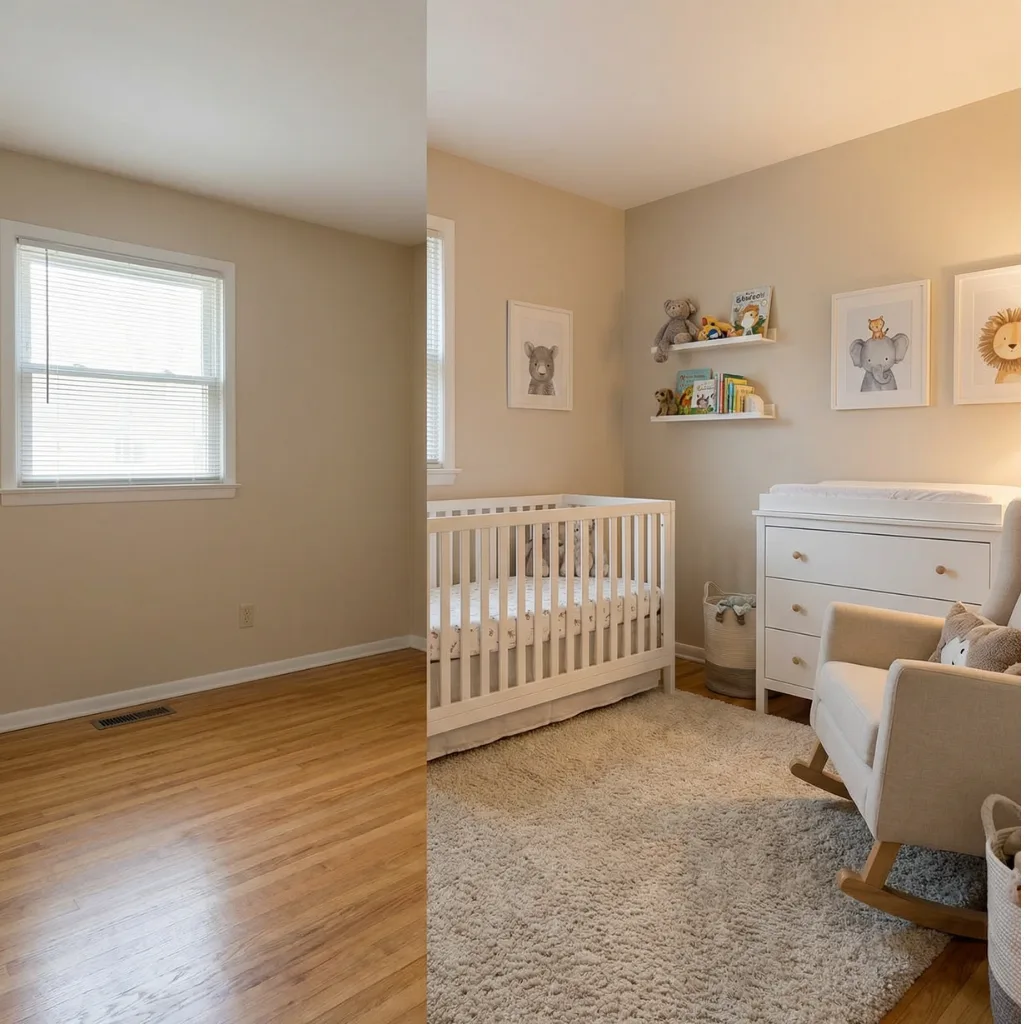
Reads as a warm neutral
So low in saturation that most visitors will call it cream. That is the point: it warms the room without announcing anything. Benjamin Moore First Light sits in this family.
- Wall #F7EFE9
- Blush #EFDDD5
- Oak #B78A5F
- Trim #FBF8F4
- Contrast #3E3B36
2. Dusty rose
The one that looks expensive
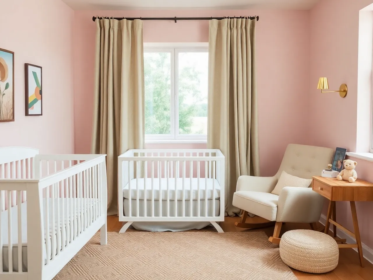
Enough grey and brown in it to read as a considered color rather than a default. Pairs with terracotta and cream, and it is the pink that photographs best in warm afternoon light.
- Wall #EADCD3
- Dusty rose #C08A78
- Terracotta #B2593F
- Cream #F4EFE6
- Contrast #6E6353
3. Clay pink
For rooms with red-toned floors
Pushed far enough towards earth that it agrees with orange oak instead of fighting it. Also the pink least likely to read as assigned.
- Wall #F1E7DC
- Clay #BE7B5C
- Rattan #D8C3A5
- Cream #F7F1E6
- Contrast #544437
4. Real pink
Only on purpose
A saturated pink on four walls is a genuinely lovely room and a two-coat repaint later. Choose it knowing that, not because the sample looked pale.
- Wall #F0D4D2
- Deep pink #D9A6A2
- Trim #FBF7F2
- Wood #A8724F
- Contrast #3A3230
Why pink doubles in strength on a wall
Three things stack up, and none of them are visible on a chip held in a shop.
- Area. Every color intensifies at scale, but pink starts closer to the threshold where "warm neutral" tips into "pink room", so it crosses it sooner.
- Bounce. Four pink walls reflect onto each other. The corners of a small nursery end up noticeably stronger than the sample predicted.
- Trim contrast. White trim next to pink pushes the pink forward. The same paint next to cream trim reads a full step softer.
Practical consequence: sample at A2 size, not A5, tape it to two different walls, and look at it after dark under the bulb you actually use. The full method is in the paint color guide.
What goes with pink
| Element | Best | Avoid |
|---|---|---|
| Trim | Cream or a warm off-white | Bright white, which turns the pink up a notch |
| Wood | Mid oak, rattan, cane | Grey-washed wood, which drains it |
| Metal | Brass, bronze, matte black | Chrome and rose gold. Rose gold plus pink is one note played twice. |
| Accent color | Sage, terracotta, camel, deep green | Cool grey. Pink plus grey is the pairing that dates fastest. |
| Textiles | Linen, boucle, jute, wool | Anything satin or shiny, which reads costume |
The most underrated pairing is pink with deep green. It stops the room reading sweet, and it is the combination that carries furthest past toddlerhood. Detail on the green half in the sage green guide.
The hedged version, which is what most people actually want
Keep the walls in a warm neutral and put every bit of pink into the layers that cost under $150 to replace. The room reads pink from the door and stays repaintable.
| Layer | Cost to change | Pink here? |
|---|---|---|
| Wall paint | $120 and a weekend | Only if you mean it for five years |
| Crib and dresser | $500 and a resale listing | Never. Buy them plain. |
| Rug | $150 to $400 | Yes, and it does more work than the walls would |
| Glider upholstery | $300+ | Yes, and it is the piece people remember |
| Bedding, cushions, curtains | $60 to $200 | Yes, freely |
| Art and shelf objects | $40 | Yes. Start here. |
When it goes wrong
- It reads sugary. The pink is too clean. Every pink that works has brown or grey underneath.
- It fights the floor. Red-toned oak plus a cool pink. Move the pink towards clay.
- It looks flat. Nothing dark in the room. One matte black curtain rod fixes it.
- It reads dated. Pink with cool grey. That combination is a specific decade and nothing else will save it.
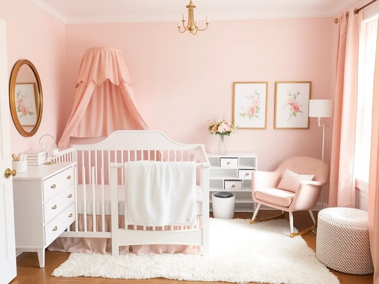
- It went costume. Pink walls plus a canopy plus gold plus florals is four decisions all saying the same thing. Pick one to be loud.
Questions people actually ask
How do I choose a pink that is not too much? +
Does pink go with wood floors? +
Will a pink nursery date? +
What is the alternative if I want pink but not a pink room? +
Keep going
Baby girl nursery ideas
Five full palettes, and how each one ages.
All nursery paint colors
Undertones, sheen and how to test properly.
Beige nursery
Where to go if the pink keeps reading too strong.
Sage green nursery
The green half of the best pink pairing.
Grey nursery
Why pink plus grey is the combination to avoid.
Nursery themes compared
Where a theme belongs, and what it costs to undo.